All Projects
Case Study
2026
Co-founder | Designer
TerraFlow.Studio Rebuild
We sold systems thinking on a site built from instinct. Two weeks to rebuild it as the argument it was supposed to be.

Practising what we pitch
We sold systems thinking on a site built from instinct. Two weeks to rebuild it as the argument it was supposed to be.
The problem, briefly
The site was not buggy. It was unsystematised, and the bugs were downstream of that.
TerraFlow.Studio sells design systems. Version one was the opposite of that pitch: every element decided individually, in the moment, by whoever was building that section. Nothing referred to anything else. That is survivable until traffic arrives, and then it is not.
Two failures came from analytics and from using the site on a phone. The rest came from auditing every page as if a client had sent it to me for review.
The rules I wrote first
Six sentences, agreed on day three, before anything was drawn. They decided every layout question that followed and are the reason two weeks was enough.
Lead with the verb, not the adjective. Every service description opens with We and an action. Capability is checkable. Adjectives are not.
One primary action per page. If two buttons compete, neither is primary and the visitor does the work of choosing.
Punctuate completely. Sentences end with full stops, including in lists and cards.
Publish the number. Price, team size, timeline, availability. Withholding them signals the answer depends on how much you look like you can pay.
Say where you are. Location is a credential in this market, not a logistics footnote.
No jokes at the point of sale. Humour belongs in the work, not on the button that commits someone to forty thousand dirhams.
Before and after, problem by problem
P1 — Positioning
Problem. The tagline was the only line on the site doing anything that resembled a claim. A somewhat creative studio is brand voice, and it is good brand voice: self-aware, human, easy to repeat. It was also standing at the top of every page with no positioning statement anywhere behind it, which meant the one sentence a client used to judge us was written to be charming rather than to be evaluated. The hero’s strongest asset was a gradient, and the gradient said nothing about the work. Location appeared once, in the footer, phrased as a disclaimer.
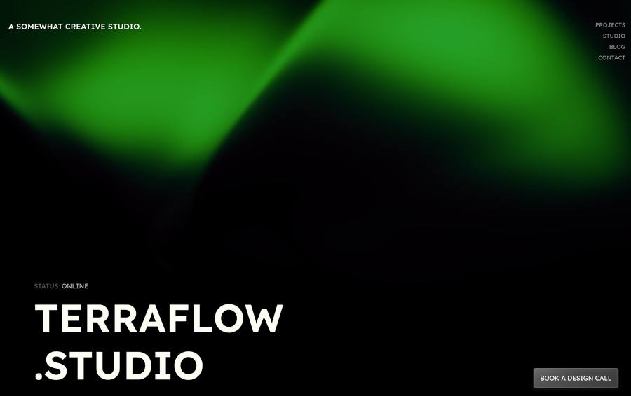
V1. Aurora hero, a somewhat creative studio, pinned CTA.
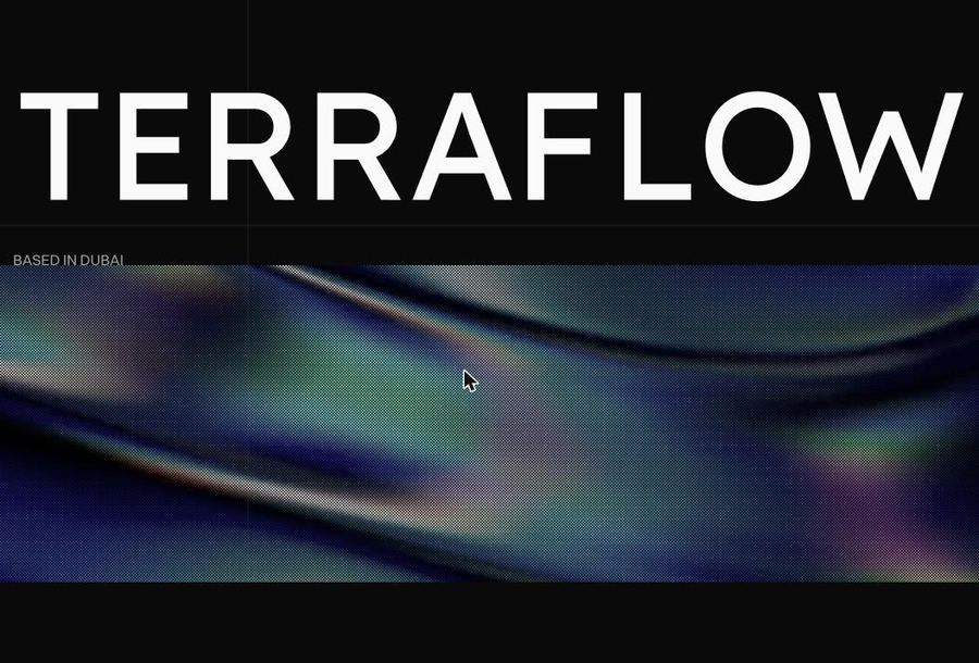
V2. Wordmark at full width, Based in Dubai in the first frame.
What I did. Split the two jobs rather than replacing the line. The tagline stayed a tagline and now lives on the search result and the social card, where brand voice is the whole point and a self-aware line is an asset. Behind it I wrote a positioning statement a client can disagree with, and put it in the footer of every page. Location moved out of the footer and into the opening frame, turning an apology into a credential. The decorative gradient became a wordmark that fills the viewport, so the first thing a visitor sees is the name rather than an effect. The tagline stopped carrying an argument it was never written to carry.
Was — A somewhat creative studio. Tagline carrying positioning as well. Now does one job, on search results and social cards.
Now — A design studio where systems outperform creative heroics. Positioning, new, in the footer of every page.
P2 — Service taxonomy
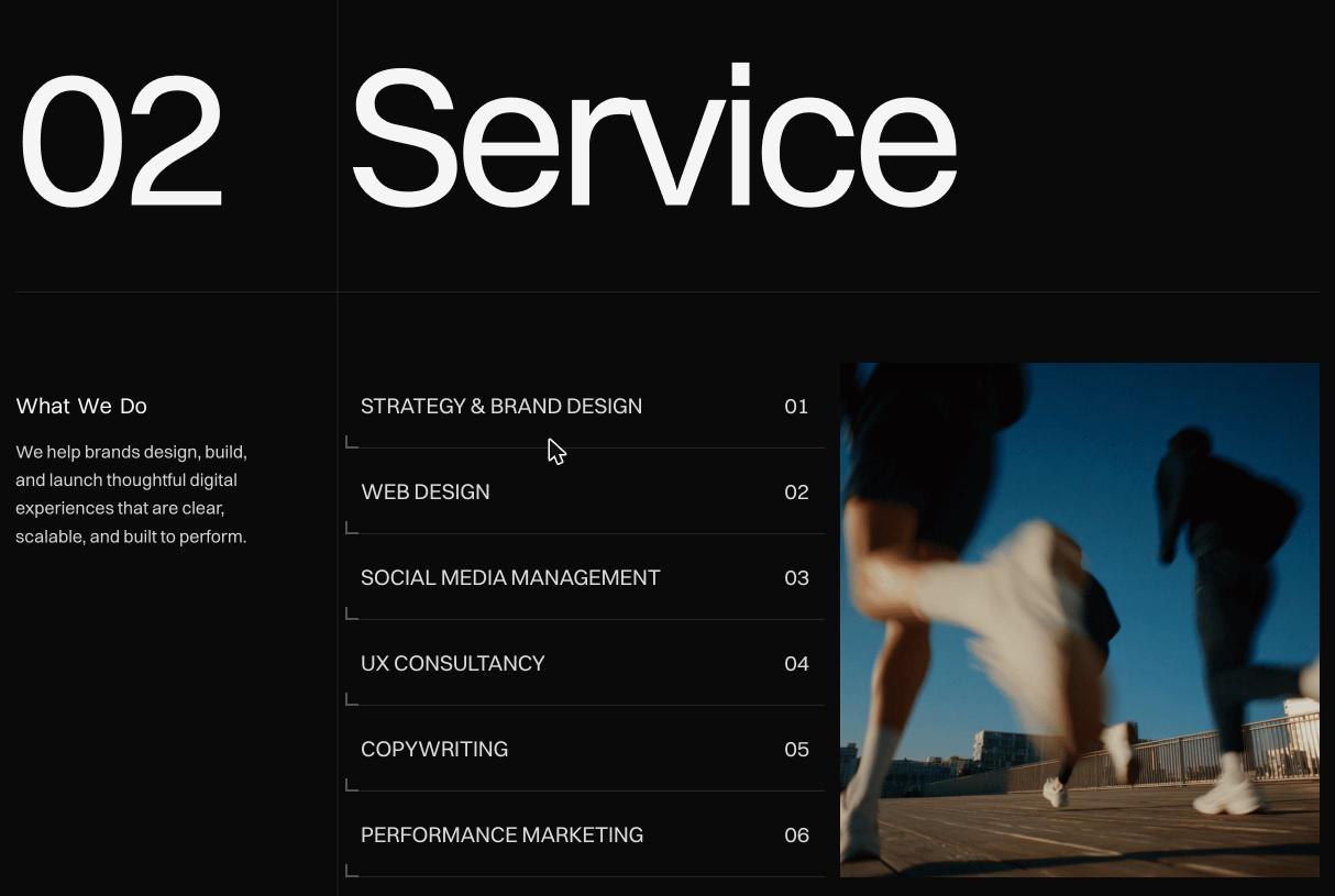
Problem. D03. Six services with two that overlapped: Design sat as a sibling of Web Design & Development, so a visitor could not choose between them because the difference did not exist. Descriptions were adjective stacks with no shared grammar and no terminal punctuation, each written where it sat.
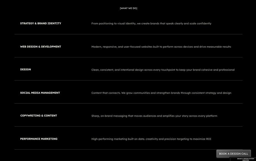
V1. Unnumbered, overlapping, unpunctuated.
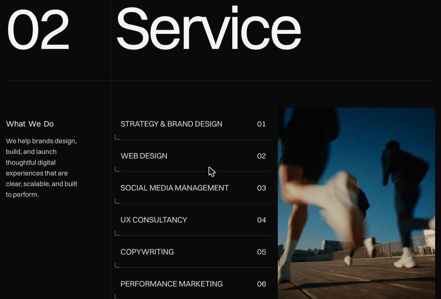
V2. Six distinct services, numbered 01 to 06, hover-linked imagery.
What I did. Gave the empty slot a real definition. Design was not a service, it was a word left in the list; it became UX Consultancy, with its own deliverable and no overlap. Rewrote all six descriptions to one frame under R01 so a service added years from now still fits, and numbered the set so the list reads as a system rather than a pile.
Was — DESIGN. Clean, consistent, and intentional design across every touchpoint to keep your brand cohesive and professional
Now — UX CONSULTANCY. We design clear and usable interfaces by organizing content, flows, and components into systems that scale across screens and devices.
P3 — Evidence
Problem. D05. The homepage showed five project cards, the Projects page showed three. Same site, two answers to how much work we had done. The page also opened with a free AI report tool, asking for commitment before it had established who we were, and competing with the only action that makes money.
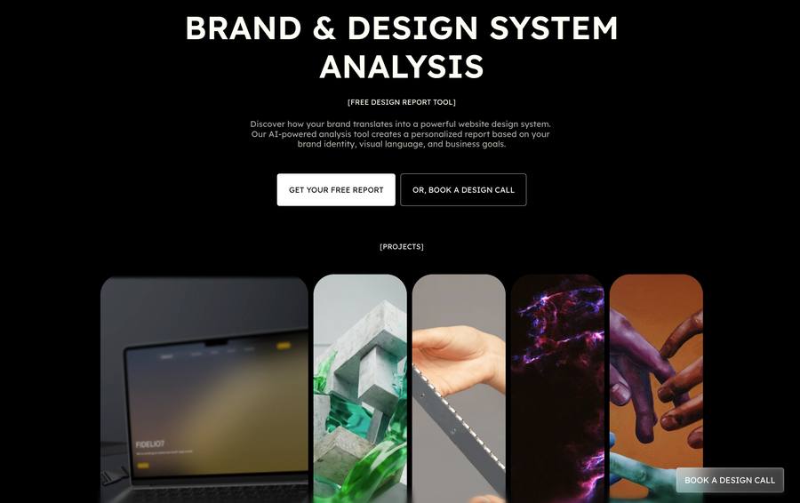
V1. Lead magnet, two CTAs, five cards.
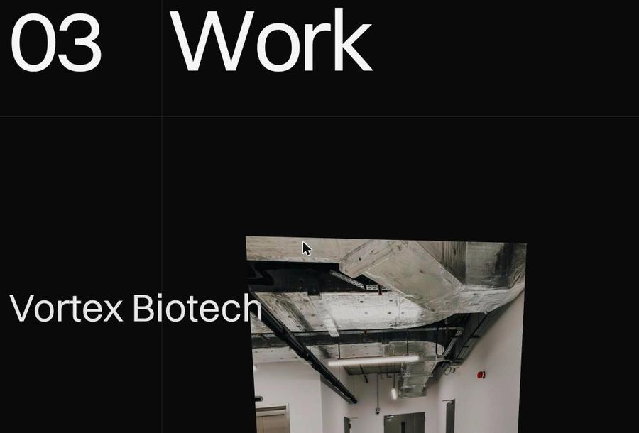
V2. Four Work items, one per screen, single View Project action.
What I did. Cut the lead magnet entirely and set the project count once, at four, so the number cannot disagree with itself. Each case study now gets a full screen with one action on it, which is R02 applied: the visitor is never choosing between two buttons of equal weight.
P4 — Pricing
Problem. D08 and D09. Space-programme tier names that had to be decoded before you knew which applied to you, a punchline on the enterprise button, US dollars for a Dubai market, and silence on the two things clients actually ask: who works on this, and how long does it take.
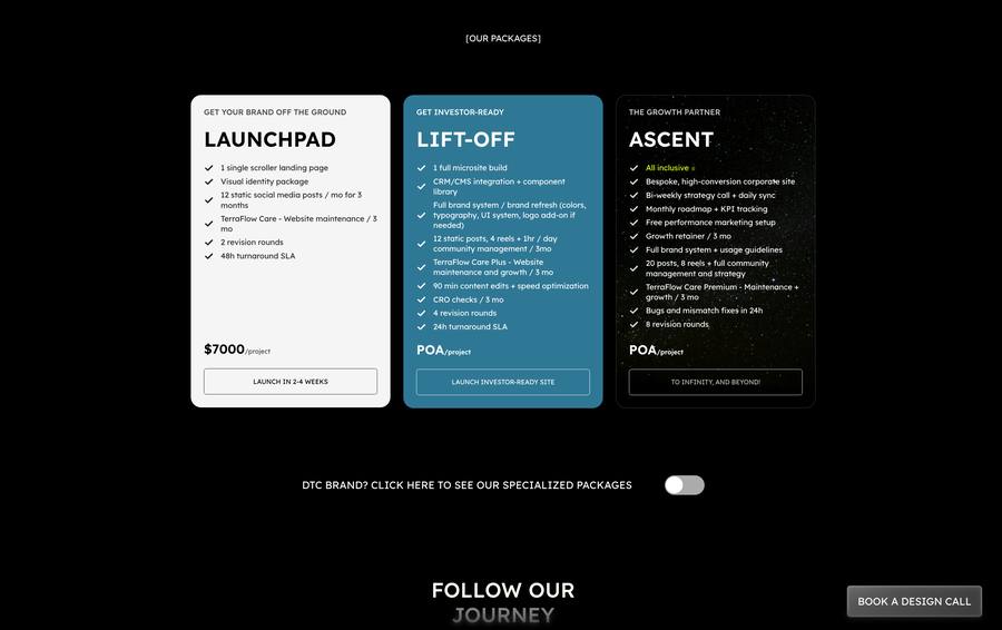
V1. Metaphor naming, USD, no team, no timeline.

V2. Audience label, AED, inclusions, team size, timeline.
What I did. Paired every tier with the audience it serves, so Launchpad reads Startups and Standard reads Growth and nobody has to decode a metaphor mid-decision. Published team composition and timeline beside the price under R04. Replaced To infinity, and beyond! with Start Project under R06. The trade-off is real and I accepted it: the new names have less personality, and at the moment someone is weighing forty thousand dirhams, scannability is worth more than charm.
P5 — Closing the page
Problem. D06. The homepage ended with a newsletter we were not sending, then a contact form duplicated from the Contact page, asking a different question. Two forms, two labels, one enquiry. Nothing on the page created a reason to act now.
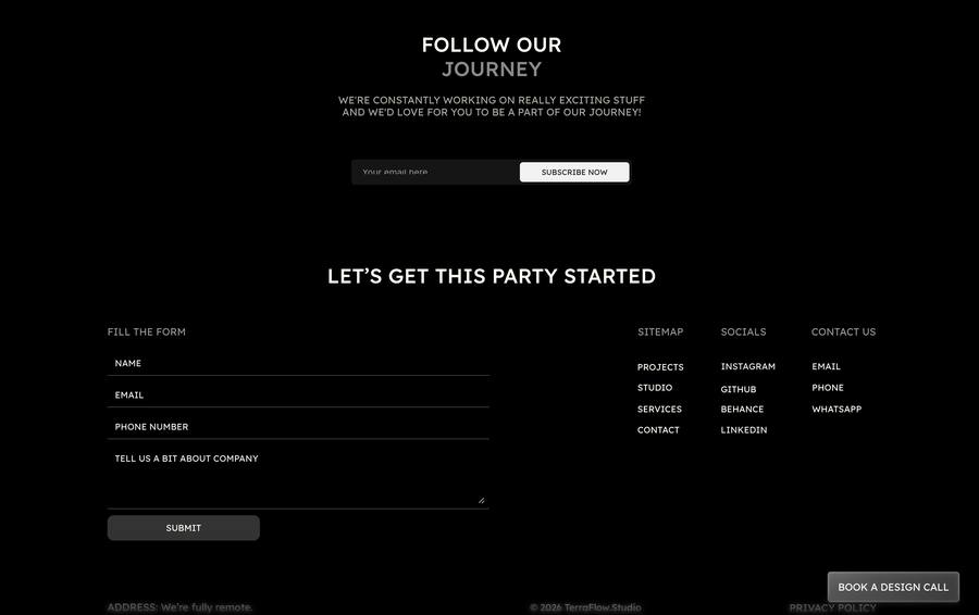
V1. Newsletter, then a duplicate form.
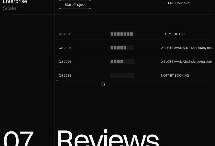
V2. Live availability board leading into Reviews at 07.
What I did. Removed the newsletter, because asking for an email we had no plan for is a promise broken by default, and removed the duplicate form so enquiry lives in one place and is written once. In their place, a quarterly availability board with segmented capacity bars. It creates honest urgency, filters out enquiries we cannot service, and is the strongest application of R04 on the site.
P6 — Voice
Problem. D07 and D08. The mission statement carried a grammatical error in the most-read sentence on the site, then undercut itself with a caption. The Blog told readers its authors get bored sometimes, which is a subheading that asks you not to read on.
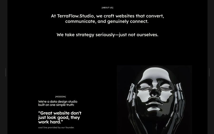
V1. A typo in the mission, then an apology for it.
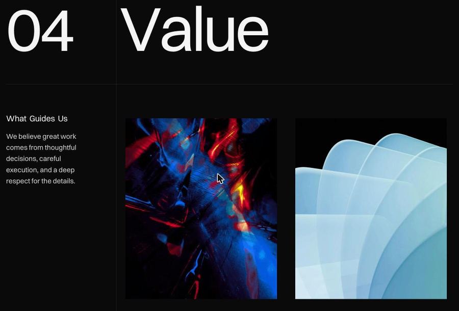
V2. Four stated principles under Value at 04.
What I did. Kept the contrast structure of the old mission line, fixed the grammar, dropped the self-deprecating caption, and made it about attention rather than effort. Personality moved out of the descriptions and into the work. The looseness that made V1 likeable is still there in the studio voice; it is no longer sitting on the sentences that carry the argument.
Was — Great website don’t just look good, they work hard. (cool line provided by our founder)
Now — Design isn’t just about grabbing attention, it’s about holding it.
What V1 had no answer to
Two sections in V2 exist because clients kept asking questions the old site did not address. Neither has a before state, which is the point.

Method. Four stages, inverting to a light section for contrast.
Value. Four principles, stated rather than implied.
Why they earn their place. Clients kept asking what happens after the deposit, so Method puts discovery, strategy, design and launch on the page in order. Value states the four principles the studio is willing to be held to, which matters more once pricing is public: transparency is easy to claim and expensive to publish.
The defect that forced the rebuild
D01 is why this was a rebuild and not a patch.
In V1 each section handled its own breakpoints, so fixing one did nothing for the next. In V2, layout is a small set of shared components with breakpoint behaviour defined once, and sections are instances of a pattern rather than individual constructions. Captured live at 406px:
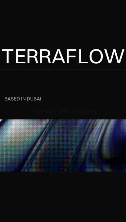
Homepage hero at 406px, wordmark scaling cleanly.
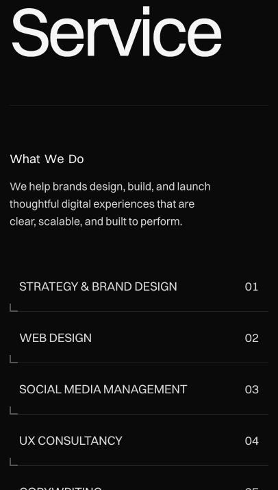
Service section at 406px, six numbered services in one column.
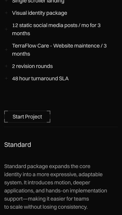
Pricing at 406px, inclusions and tiers reflowed to a single column.
What holds. The wordmark scales to fill without breaking, the numbered service list keeps its structure in one column, and pricing reflows without losing the inclusion groupings. Most of the speed improvement came from deleting things rather than optimising them: the lead magnet and its dependencies left the page, five cards became four, and the uncompressed hero became a compressed video that loads after the text.
Results
Analytics were instrumented before the rebuild, so the comparison is like for like. Four figures are before and after. Two are current readings with no clean baseline, and are labelled as such rather than dressed up as improvements.
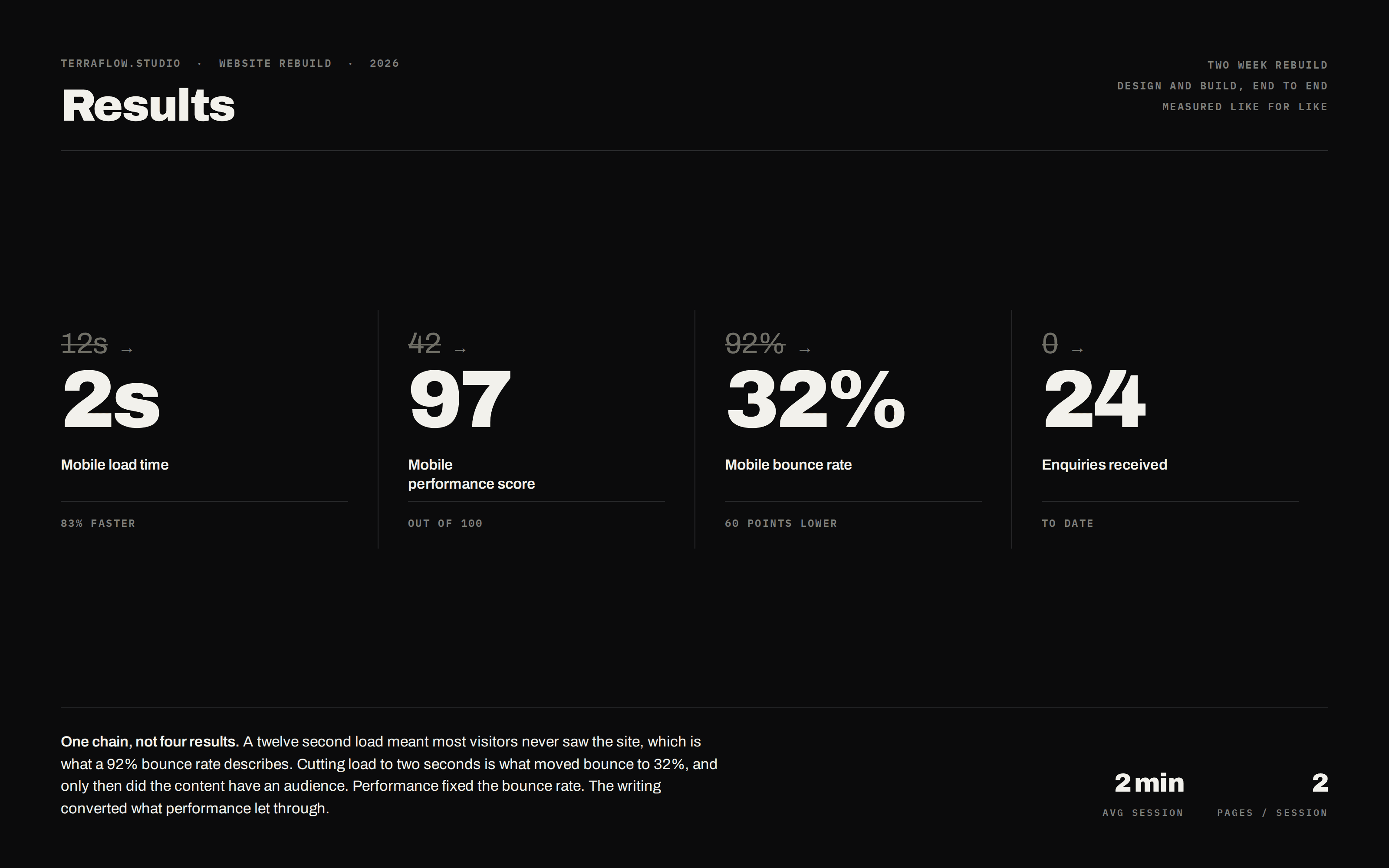
What the numbers actually say
They are one chain, not six results. A twelve second load on mobile means most visitors never saw the site at all, which is exactly what a 92% bounce rate describes: nine in ten people leaving before the page finished painting. Cutting load to two seconds is what moved bounce to 32%, and only then did the content have an audience. The enquiry count follows from that, not from the copy being better in isolation.
Which is worth being precise about, because it cuts against my own case. The writing system and the architecture did not fix the bounce rate. Performance did. What the writing did was convert the visitors that performance finally let through, and that is a smaller and more honest claim than the numbers invite.
Two sessions per visit at two minutes each is a reasonable reading for a studio site, though I would want to know which second page people land on before calling it a success. The 20,750px homepage makes that number harder to interpret than it looks: two pages could mean genuine interest, or it could mean someone gave up scrolling and went looking for pricing in the navigation.
The 0 figure for enquiries is real and it is the one a hiring manager should push on. V1 had two contact forms and no enquiries through them across its lifetime, which is why D06 was a defect rather than a preference.
The qualitative result: the site shipped before the client meeting it was built for, and the studio can now point at its own homepage as evidence for the method it sells.
What I would change
Two weeks bought a working site, not a finished one.
The homepage is 20,750px on desktop and 23,391px on mobile. Roughly thirty viewports, with the mission line pinned through a long scroll-jacked sequence and the availability board sitting past 18,000px. It is a deliberate cinematic choice and it looks good. It also puts real distance between a visitor who wants pricing and the pricing. I would test a jump navigation before defending the current version.
Method has no number. Service is 02, Work 03, Value 04, Pricing 06, Reviews 07, and Method is labelled only METHOD. A visitor counting along hits a gap. It is a break in the exact system the page argues for, which makes it the most annoying item here and a five-minute fix.
Headings animate letter by letter. The markup splits every character into its own node, so TERRAFLOW is nine separate fragments. The motion is the best thing on the site and this is what it costs: assistive technology may announce those headings a letter at a time. I would keep the effect and add an accessible label underneath it.
Typos survived the rewrite. Maintenance is misspelled in two pricing tiers. A line on the Studio page reads Our teams comes from. One em dash slipped into the Standard description. I wrote six rules about consistency and shipped without a final proofing pass, because QA was one day and the deadline ate it.
The tagline only exists in metadata. A somewhat creative studio lives in the page description and the social card, and nowhere a visitor can see it. It does mean the line people quote back to us only shows up if you never arrive. I would test giving it a home on the Studio page.
The key figures are the weakest content on the site. Ninety-five, ninety-six and ninety-two per cent, from six projects, with no methodology. The studio’s fourth value is radical transparency and percentages without a denominator do not meet it.
No usability testing. Not one session. Every architectural decision here is a reasoned argument, not a validated one. The numbered homepage sequence assumes visitors read in order, and I have no evidence that they do.
The thing I would keep: writing the rules before drawing anything. Six sentences decided every layout question that came after, and they are the only reason two weeks was enough.
Gallery